

Featured examples
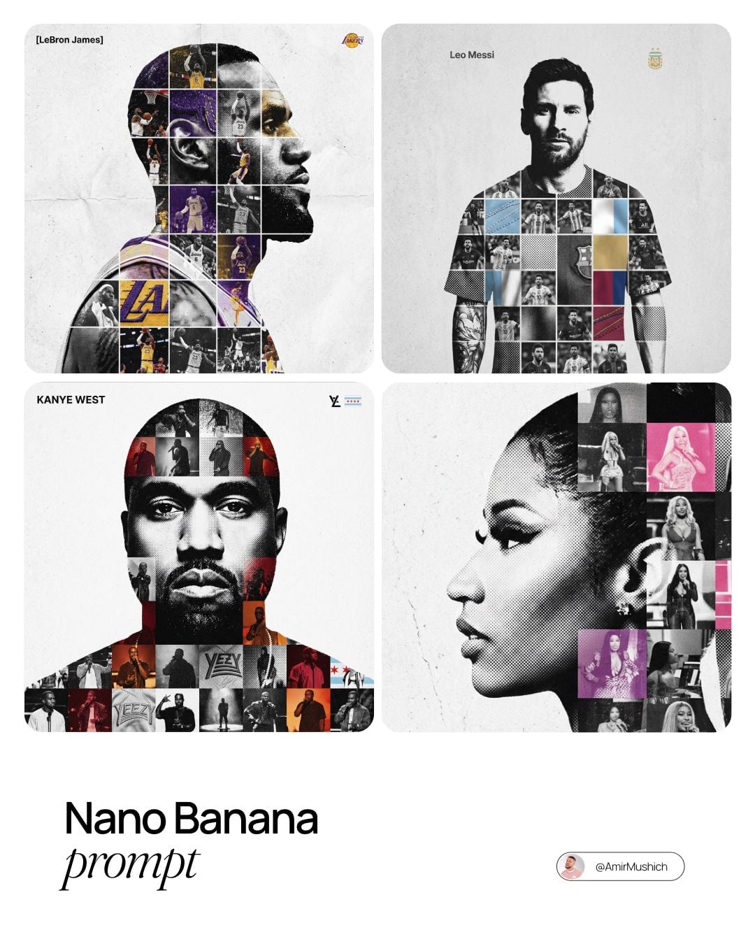
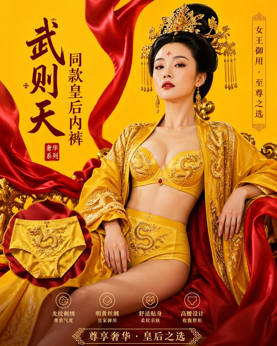
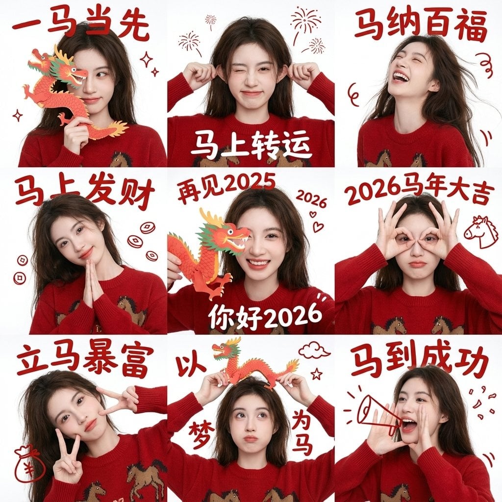
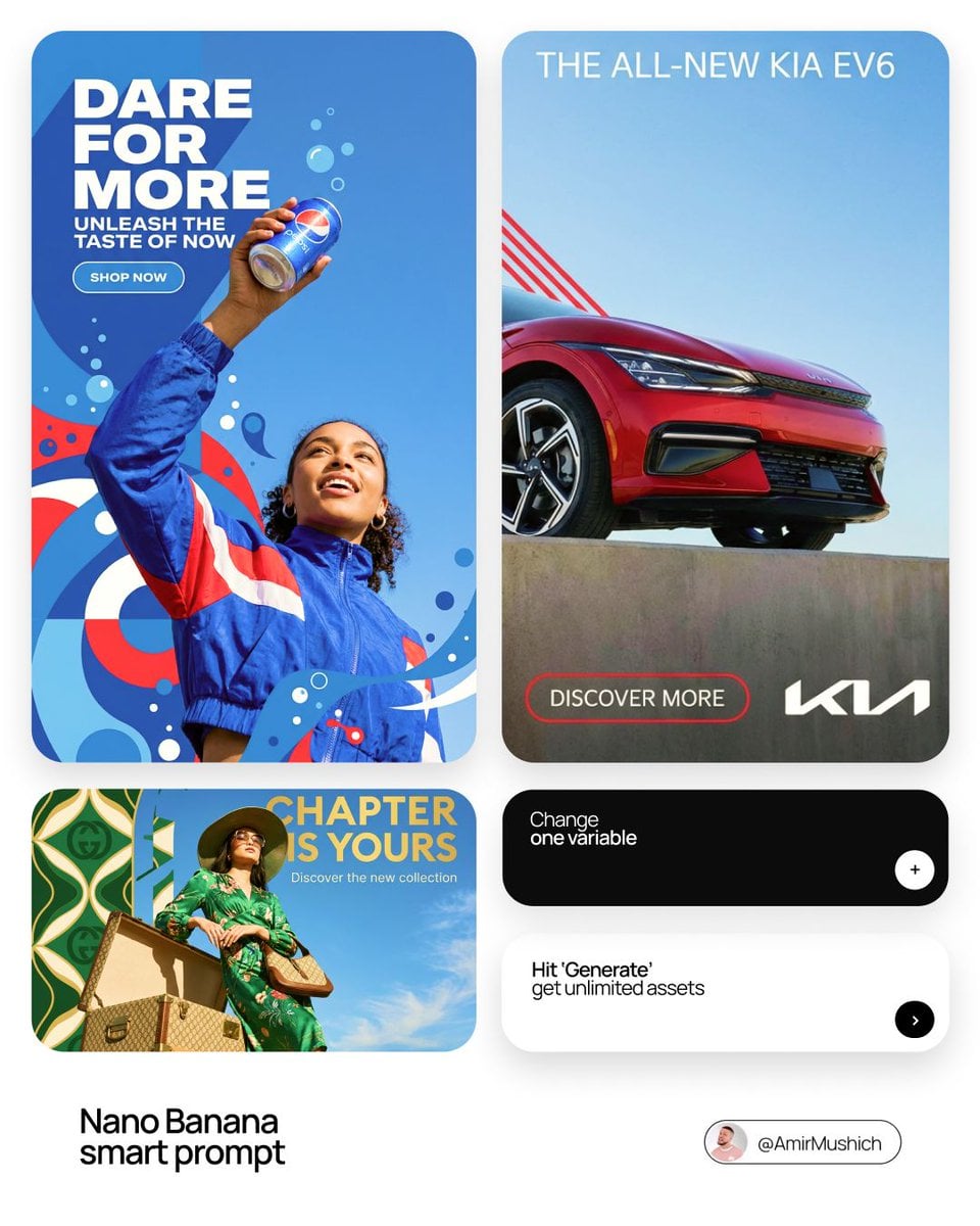
Poster & Typography
One idea, one loud element, type that holds from across a room.
400 examples50 templates
All examples


Templates for this use case
- 3D Caricature Drama PosterUse when you want a mock movie poster that tells a three-beat gag with your own captions over pre-set characters and scenes.
- BBQ Slice-of-Life Anime Key VisualUse when you need a poster for a fictional food-themed anime with a fixed four-girl cast and want to rename the show and restyle the lead.
- Bottled Tea Promo PosterUse when a bottled drink launch needs a splashy retail poster with a price sticker and a where-to-buy footer in Japanese.
- Champions League Match Infographic PosterUse when you want a broadcast-style hype poster for one Bayern-PSG tie and only need to update the round, the date and the players.
- Cinematic Car Ad PosterUse when you need a campaign-grade car poster for a dealer, a concept reveal or a portfolio piece, complete with ad typography.
- Cinematic Car Billboard PosterUse when a car launch or dealer campaign needs a single hero car standing against its own brand name at billboard scale.
- Claymation Teen Girl with HeadphonesUse when you want this exact Sony claymation cover as a starting prompt; the controls rename its field labels rather than its content.
- Cosmic Neon Course BannerUse when a beginner-friendly course or guide needs an anime-style promo banner and you mainly want to update the hook, button and year.
- Course Promo Banner GridUse when you need four A/B banner variants for one course or school and want to write every headline yourself.
- Editorial Ink Illustration TemplateUse when you want a fashion-poster portrait with sketchbook energy rather than a photo, and have a person and a road-trip place in mind.
- Explosive Japanese Sales Page PosterUse when you need a deliberately loud, infomercial-style Japanese sales poster and only the headline, numbers and closing line change.
- Flag Paint Stroke With CityscapeUse when you need a national-pride visual for a travel, tourism or holiday post that carries no on-image text.
- Football Player Doodle Stats PosterUse when you want a fan poster for one player with their club and national-team numbers written around the photo.
- Forest Restaurant Anime Movie PosterUse when you need a storybook film poster for a fictional family movie and only want to name the restaurant and retitle the film.
- Four-Up Fake Movie Poster GridUse when you want a sheet of joke film posters whose scenes, taglines and casts are already written and only the four titles need naming.
- Gold Laurel Promo BannerUse when a Japanese AI side-hustle course wants a flashy gold award-style thumbnail with laurel wreaths and stacked selling points.
- Gold Text VTuber Debut ThumbnailUse when a VTuber debut needs a loud gold-lettered thumbnail with rainbow rays, a retro mic and a badge for the stage name.
- Golden Flow Oriental City PosterUse when you need a mythic city tribute poster and only the title line, date and credit have to change.
- Herbal Soup Mix Packaging LabelUse when you have a chicken-illustration label and need it recomposed into a soup-mix pack with new headline, ingredient and usage copy.
- High-Contrast Typographic Profile PosterUse when you want a poster that reads as one person's profile and one message, for a gig, a talk or a music release.
- Isometric Landmark DioramaUse when you need a landmark graphic with the country name on it, for a travel post, a set of city cards or a geography lesson.
- Isometric Machine Cutaway DioramaUse when a product or engineering post needs a see-inside hero image of one machine with its name set large above it.
- Isometric Travel PosterUse when you want a city travel print in a strict three-color mid-century style rather than a full-color skyline.
- Japanese Ad Banner 2x2 GridUse when you need a sheet of Japanese-style digital ad banners at once and only the destination, product name and price need swapping.
- Magical Vortex 3D Product PosterUse when a bottle, jar or can needs a fantasy CGI hero poster with a swirl of its own ingredients and one tagline.
- Microwave Deity Mascot Character SheetUse when you need a Japanese-style mascot reference sheet with trait boxes and blessings for a contest entry or character pitch.
- Mid-Century Isometric Travel PosterUse when you want a screen-print style city poster with one bold ink and the city's name set in type at the top.
- Miniature City Travel CardUse when a destination needs a premium souvenir-style visual for a travel campaign or a city guide cover.
- Minimalist Automotive Poster TemplateUse when a car needs a clean editorial poster for Reels or Stories with typography as the only decoration.
- Mixed-Media Editorial PortraitUse when a portrait needs an expressive, poster-like treatment with collage and paint rather than a clean photo.
- Monochrome Watercolor City Travel PosterUse when you want a wall-art or stationery style city print in a single ink color rather than a full-color travel illustration.
- Neon Green Side Hustle ThumbnailUse when a Japanese-language money or side-hustle video needs a high-contrast thumbnail and the checklist copy is already written.
- Neon Pop School Ad Banner GridUse when a youth-facing school needs a punchy banner set with neon and pop variants and you want to rewrite most of the headlines.
- New Wave Torn Paper Film PosterUse when a film night, gig or launch wants a raw analog poster and you have a headline and one line of detail to set on it.
- Passport Worlds Atlas SceneUse when a trip across several cities needs one hero visual that shows all the destinations at once.
- Pastel Paper-Collage Travel PosterUse when you want a calm, gallery-style landscape travel poster of a place in cut-paper pastels instead of a photo.
- Photo and Watercolor Ad Banner GridUse when you need a warm, home-and-family banner set for a course and can keep the written headlines as they are.
- Retro Automotive Travel Poster TemplateUse when a specific car and a specific road need a flat-ink 1970s tourism poster with a headline and a real brand logo.
- Rough Ink Portrait With Companion AnimalUse when you want a portrait poster of someone with their pet or spirit animal, drawn rough rather than rendered.
- Starry Purple VTuber Debut ThumbnailUse when a new VTuber needs a first-stream announcement image with a fixed elegant purple design and only the name, blurb and date to fill.
- Stencil Typography Fashion PosterUse when you need a magazine-style typographic poster where the type and the model share one frame without covering each other.
- Streetwear Hoodie Ad With Shop UI AccentsUse when you have a photo of someone in a hoodie and want it staged as an e-commerce style fashion ad with shop-page details.
- Teasing Couple Light Novel CoverUse when you need a romance light novel cover with a fixed teasing-couple pose and only the title, taglines and his hair color to set.
- Top-Down Instagram Table SceneUse when a food or lifestyle account wants a physical, photographed version of its own post, with real people eating inside the frame.
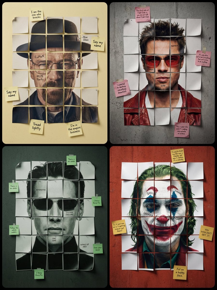
- Torn-Newspaper Collage PortraitUse when a portrait needs to look hand-made and editorial, for a music poster, a magazine cover or a wall print.
- Travel Food Postcard TemplateUse when a destination food post needs one image that sells both the dish and the place it comes from.
- Travel Planning Tabletop SceneUse when a destination or eSIM campaign needs a diorama-style hero image with a map, landmarks and travel props.
- Vacuum-Sealed Pouch Product ShotUse when you want a product presented as sealed retail packaging for a launch teaser or a mock hang-tag shot on black.
- Vintage 1960s Beer Ad PosterUse when you want a nostalgic mid-century beer ad for a bar wall, a craft brand or a period-styled campaign.
- Vintage Travel Postage StampUse when a destination needs a souvenir stamp graphic for a print, a sticker or a travel-brand asset.
How it is built
A poster is a hierarchy of type, image, and empty space that has to work from across a room. The skeleton is a dominant headline, a supporting visual, a date or venue lockup, and margins that keep the edges from collapsing. The parts you rewrite most often are the headline wording, the typeface pairing, the alignment grid, and the accent color. Treat the event facts—time, place, names—as slots that must stay literal. Illustration, texture, and photographic mood are the controls. If the model stacks every idea at the same size, fills the margins with ornaments, or turns letters into unreadable decoration, you have a collage, not a poster. One idea, one loud element, one quiet rest.
Watch-outs
- 01Lock the facts (date, venue, names) as literal slots, not styled noise.
- 02Name the hierarchy: one dominant line, then support, then meta.
- 03Leave margins empty. Models fill them with ornaments by default.
- 04If letterforms become illustration, specify “real type, not drawn type.”