

Three words and a white field, not a dragon on a wall
Logos fail when you describe a scene instead of a brand. Start with keywords, demand a simple mark on pure white, and show the mark at badge size.
2026/09/01
Controls this guide covers
brandStart with three brand words, not a scene. A dragon on a wall is illustration, not a mark.
logoDemand a pure white background and a simple mark so it can be keyed later.
paletteSee why →Give 4–6 named colors. Open palettes drift toward neon gradients.
Related templates
Browse Brand & Logo in the gallery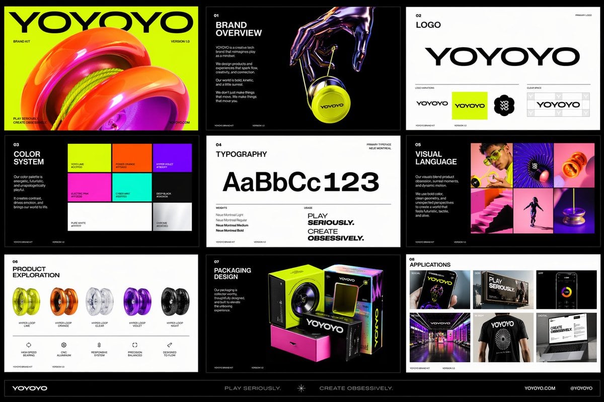
Create a polished multi-page (multiple images) brand kit for a company called [YOYOYO]. The brand should feel playful, futuristic, vibrant, and design-forward, blending the energy of a toy-inspired product with the sophistication of a premium creative tech brand. Use a bold, experimental visual identity with bright color, clean geometry, modern typography, dynamic motion cues, and slightly surreal imagery. The overall mood should feel inventive, youthful, rhythmic, tactile, and high-concept, with a balance of fun consumer product culture, fashionlike presentation, and contemporary digital design. Include a sense of product obsession, visual experimentation, packaging exploration, editorial photography, immersive retail, and cross-platform brand application. Make it feel like a confident, contemporary brand world that is both accessible and art-directed, with strong graphic cohesion and a premium creative-studio aesthetic.
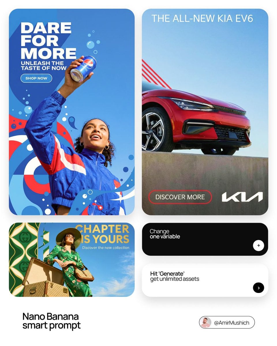
[BRAND NAME] | [HEADLINE] | [SUB-TEXT] | [CTA]. Act as a Senior Art Director. PHASE 1: INTEGRATED COMPOSITION & OVERLAP. - Layout: Seamless fusion of 2D graphics and 3D photography. - Overlap Logic: The subject and their primary "Product Prop" (e.g., a car, a device) must physically overlap the graphic panel to break the "wall" between design and photo. - Unity: Geometric shapes from the graphic side must bleed into the photographic sky area. PHASE 2: BRAND & CATEGORY SIMULATION. Autonomously analyze the [BRAND NAME] and its industry category: - INDUSTRY CONTEXT: * If Automotive: Include the vehicle and a person interacting with it. * If Tech: Include flagship devices/gadgets. * If Fashion/Lifestyle: Focus on editorial poses and premium accessories. - SHAPE SIMULATION: Match shapes to brand identity (e.g., Sharp/Speed for Auto, Minimalist/Grid for Tech). - COLOR SIMULATION: Use the brand's primary signature hue for both the graphic pattern and the subject's outfit/accents. PHASE 3: TYPOGRAPHY & CUSTOM CONTENT. - Headline: Display "[HEADLINE]" in a bold, modern Sans-Serif font. (If [HEADLINE] is empty, generate a high-energy slogan for [BRAND NAME]). - Sub-headline: Display "[SUB-TEXT]" below the headline. - Button: Create a minimalist pill-shaped CTA button with the text: "[CTA]". - Interaction: Text layers should have 3D depth, sitting partially behind the subject or product prop. PHASE 4: PHOTOGRAPHY & SUBJECT. - Perspective: Extreme low-angle (worm’s eye view) looking up. - Subject: A diverse persona reflecting the brand's audience. - Environment: Massive, clear blue sky as the backdrop. - Visual Link: Subject's styling must incorporate the Brand's primary color. PHASE 5: FINAL VISUAL STYLE. High-end commercial aesthetic. Crisp, saturated, professional fusion of flat vector art and realistic photography.
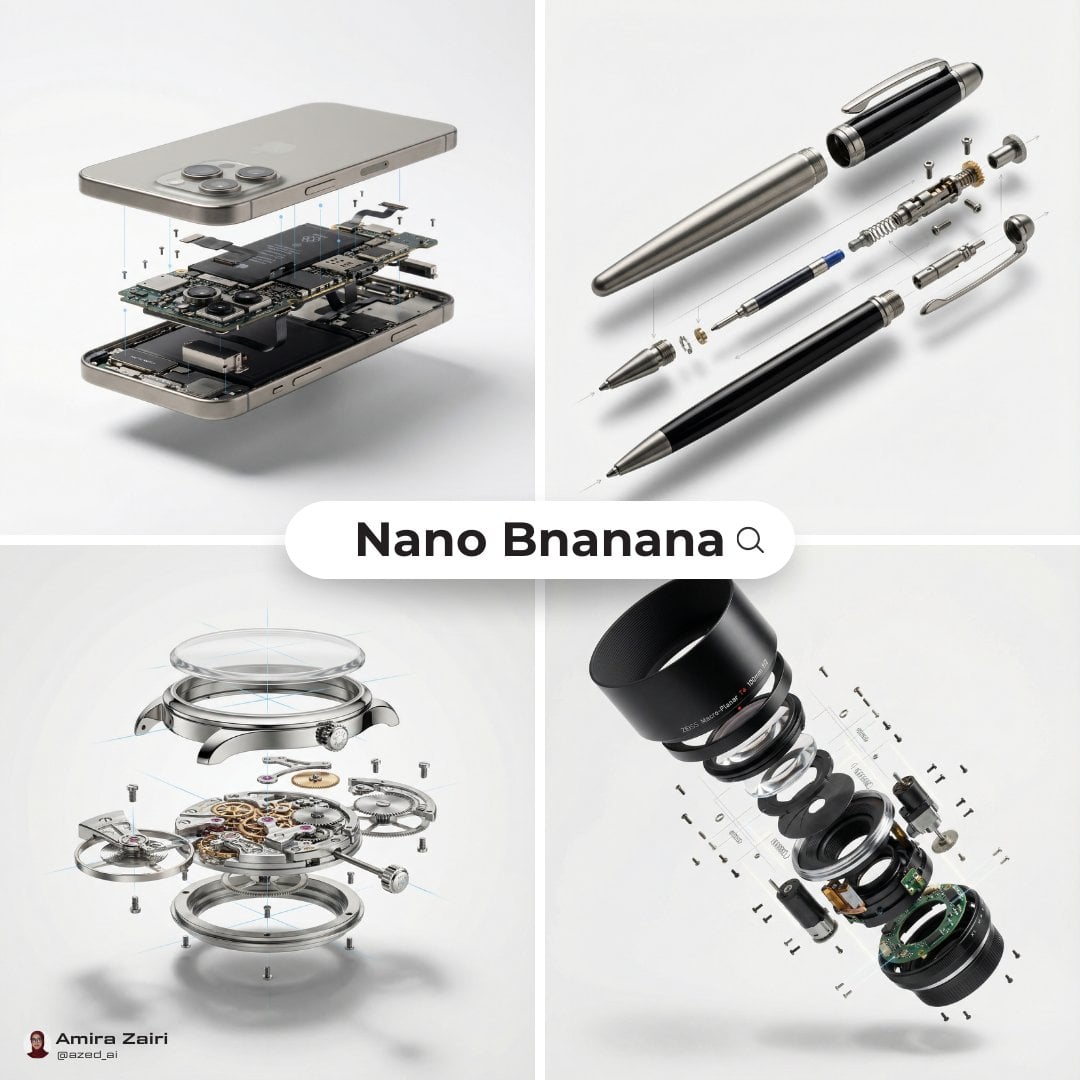
Create an exploded products with inner mechanics [product], high-end product advertising, white seamless background, exploded view with inner mechanics revealed, outer shell hovering above core, micro screws and components suspended, perfect alignment guides implied, crisp soft shadow, ultra realistic, macro product photography, 100mm lens look, f/8, 8k, 1:1
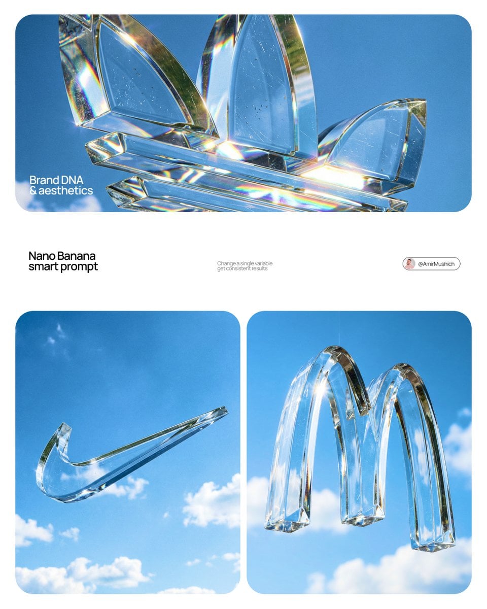
Act as a High-End Product Photographer and CGI Artist. PHASE 1: SUBJECT & LOGIC Generate a massive, perfectly centered, three-dimensional physical sculpture of the official, unaltered corporate logo for [BRAND NAME]. The sculpture must strictly adhere to the brand’s precise logo geometry and proportions (1:1 from brandbook). The sculpture is suspended in mid-air. Autonomously identify the exact official shape and structure of the [BRAND NAME] logo and render it as a single, flawless glass object without any modifications. PHASE 2: MATERIALITY (GLASS) The entire logo is made of hyper-realistic, optical-grade crystal glass (not water, not gel). The material is solid, colorless, and boasts high clarity with a high refractive index. It must look heavy and монолитное (monolithic). The glass structure contains subtle, photorealistic microscopic flaws: fine polished scratches on the surface and minor internal inclusions (dust particles/seed bubbles, very few) to avoid “CGI plastic.” The edges must be precision-beveled and fire-polished. PHASE 3: ENVIRONMENT & CAUSTICS The logo is suspended against a strictly clean, bright blue sky with sparse, naturally defined white cumulus clouds. NO land, NO trees, NO palms. The background is purely atmospheric. The focus is entirely on the glass logo. Critically render hyper-realistic, complex glass caustics: intense, sharp patterns of focused light and color (refractions of the blue sky) cast inside and onto the surface of the glass form due to the sunlight passing through it. TECH SPECS Rendered with Arnold or Octane. Phase One XF, 120mm Macro lens. Aperture f/5.6 for sharp depth across the entire glass sculpture. Intense, direct sunlight (hard lighting) to maximize caustics. Global illumination, ray-traced refractions (double-sided geometry), and chromatic aberration emulation (subtle) for optical realism. Fine grain film emulation (Fujifilm Velvia 50).
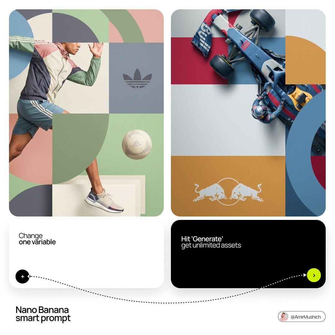
[BRAND NAME]. Act as a World-Class Editorial Designer. PHASE 1: DYNAMIC SUBJECT LOGIC. - Subject Selection: Autonomously analyze [BRAND NAME]. - Layering (The Sandwich Effect): Interweave the subject with background shapes. Some parts of the car/person must be hidden behind geometric blocks, while other parts (wheels, limbs, props) must overlap them to create 3D depth. PHASE 2: GRID & GEOMETRY. - Layout: A clean 2x2 grid composition. - Overlays: Superimpose large, bold geometric arcs and circles over the grid. - Visual Balance: Place one iconic product prop (e.g., a floating key fob for cars or a ball for sports) in a separate quadrant to balance the subject. PHASE 3: SOPHISTICATED MUTED PALETTE. - Color Direction: DO NOT use aggressive neon or oversaturated colors. - Palette: Identify the core colors of [BRAND NAME] and shift them to a "Sophisticated Muted" spectrum. - Tones: Use desaturated, earthy, or "dusty" versions of the brand colors (e.g., instead of hot pink, use dusty rose; instead of bright mint, use sage green; instead of royal blue, use slate blue). - Finish: Matte, flat color blocks with zero gradients. PHASE 4: PHOTOGRAPHY & LIGHTING. - Subject Style: High-end commercial studio photography. - Lighting: Soft, diffused studio lighting with gentle highlights. No harsh shadows. - Integration: The subject must feel physically embedded into the graphic grid. PHASE 5: MINIMALIST BRANDING. - Logo: Place a clean, single-color [BRAND NAME] logo in the center of one background block. No taglines, just the iconic symbol.
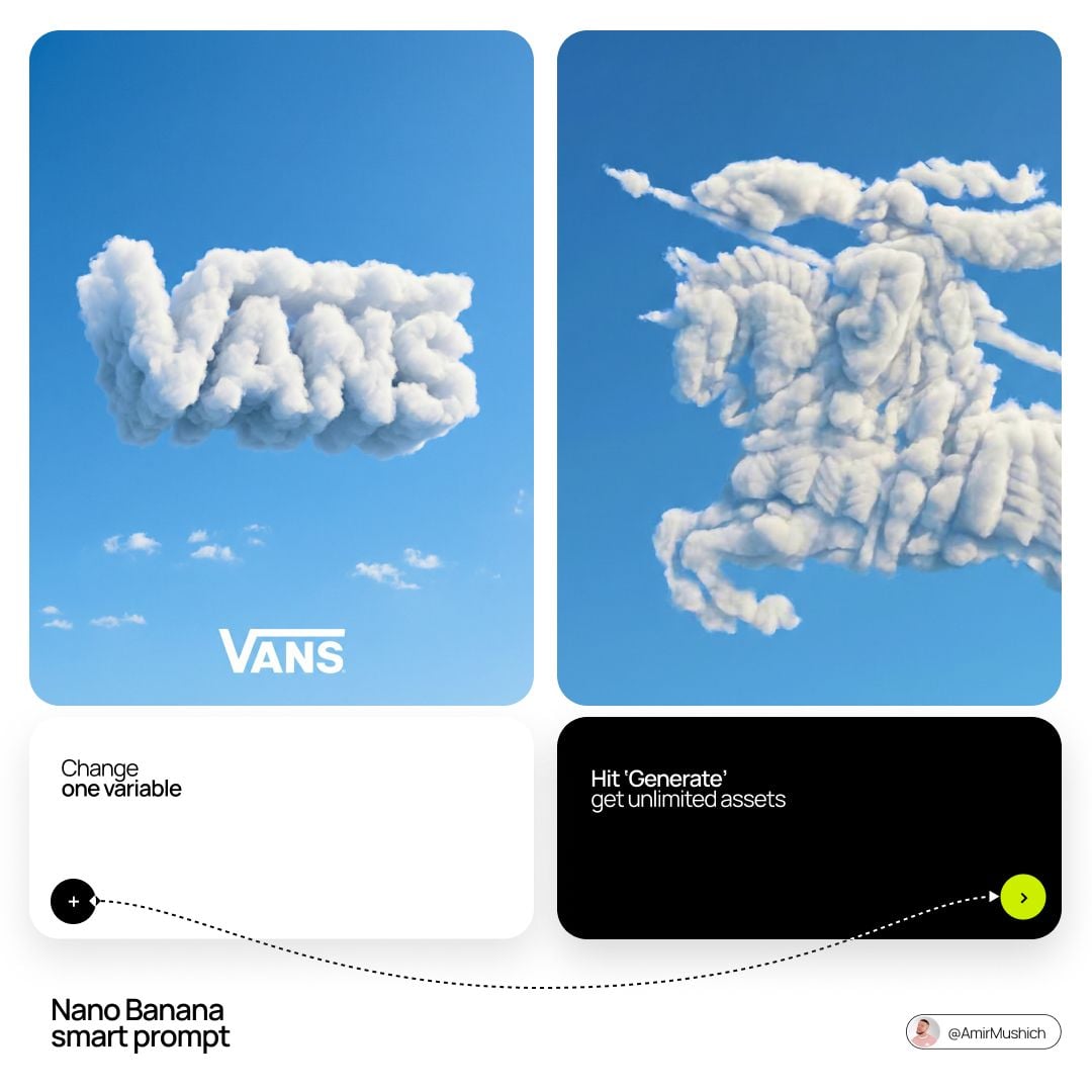
[BRAND NAME]: The name of the brand. Goal: Generate a single, minimalist, and surreal image where a cloud is shaped like the brand's logo. 1. THE LOGO CLOUD - **Subject**: A massive, photorealistic cumulus cloud in the exact geometric shape of the [BRAND NAME] logo. - **Texture**: Puffy, soft, and voluminous with natural sunlight illuminating the edges. - **Volume**: 3D sculptural appearance with realistic shadows within the cloud folds to show depth. 2. ENVIRONMENT & BACKGROUND - **Sky**: A vast, clear, vibrant blue summer sky. - **Secondary Elements**: A few small, wispy, natural clouds scattered far in the background to enhance the sense of scale and realism. - **Lighting**: Bright, direct daylight coming from the side to create high-contrast highlights and shadows. 3. INTEGRATED BRANDING - **Text**: The word "[BRAND NAME]" written in a clean, bold white sans-serif font. - **Icon**: A small, flat white version of the brand's logo placed next to the text. - **Positioning**: The branding (text + logo) is centered at the bottom of the frame, acting as a subtle anchor to the giant cloud above. 4. STYLE - Surrealist photography, ultra-minimalist composition, high resolution, 8k, cinematic look, clean and airy vibe.